Class
Overview
Process
My Role | Lead UX Designer
My role as Lead UX Designer was to iteratively wireframe potential solutions, conduct competitive and internal research, organize codesign workshops and design reviews, and provide assistance for any interviews with users and stakeholders.
For interviews, there were times that I led the interview, and other times where I would assist a User Researcher in notetaking and/or observing the interview. For each phase of research, I was heavily involved in the interview design and planning.
Kickoff Meeting
Goal
Explore the business requirements and identify possible challenges that we may experience
Takeaways
- During the meeting, we crafted a visual representation to illustrate the potential appearance of the redesigned concept and the specific data it should deliver
- This visual aid proved to be vital as it promptly highlighted the components from the two legacy reports that require integration into the redesigned report
- The legacy reports are static and lack interactivity, which does not meet our needs. Our objective is to create an interactive solution that offers users a seamless experience, allowing them to effortlessly access and explore data at deeper levels.
- Acknowledging the longstanding usage of these tables and graphics by our users, we aimed to develop a solution that strikes a balance between robustness and familiarity
- Despite the outdated nature of the two legacy reports, they continue to hold significant value for many users in their daily work. Keeping this in mind, our intention was not to diminish the value these reports offer to users when crafting our solution
Business Requirements
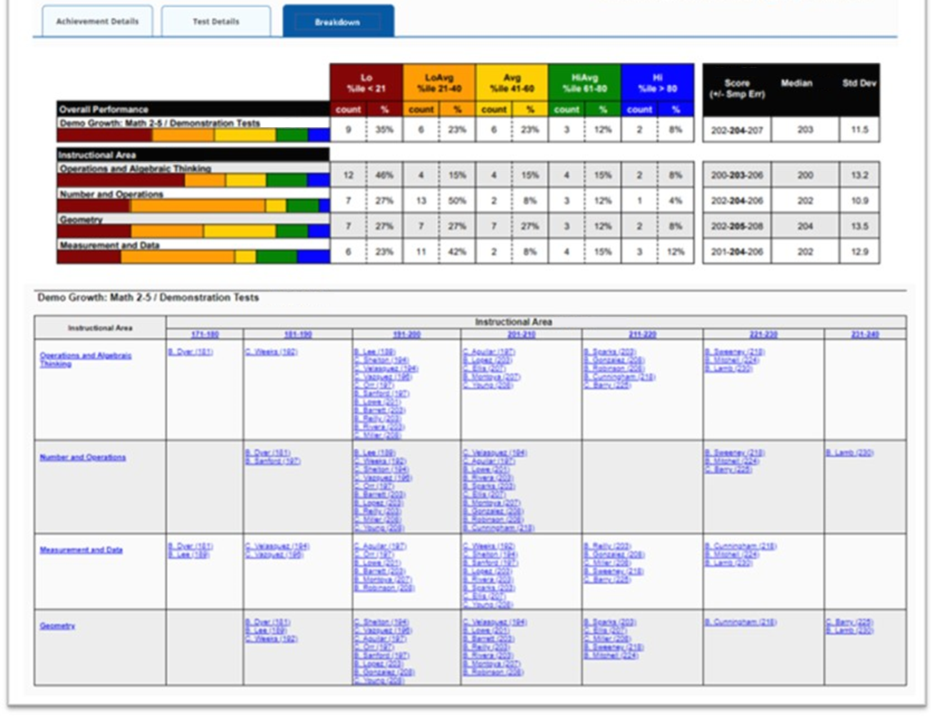
- We are considering the possibility of housing new elements in a separate tab, which our team has named 'Breakdown'
- Incorporate elements from two legacy reports that are retiring in the next year
- The newly introduced elements should be interactive, enabling users to delve deeper into the data for a more comprehensive understanding
- Consider how this new feature fits into the company's ecosystem
- Our objective is to enhance the visual appeal of the reports, as the current ones appear outdated. Incorporating data visualizations is strongly recommended to achieve this goal
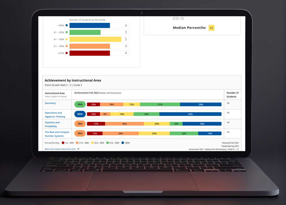
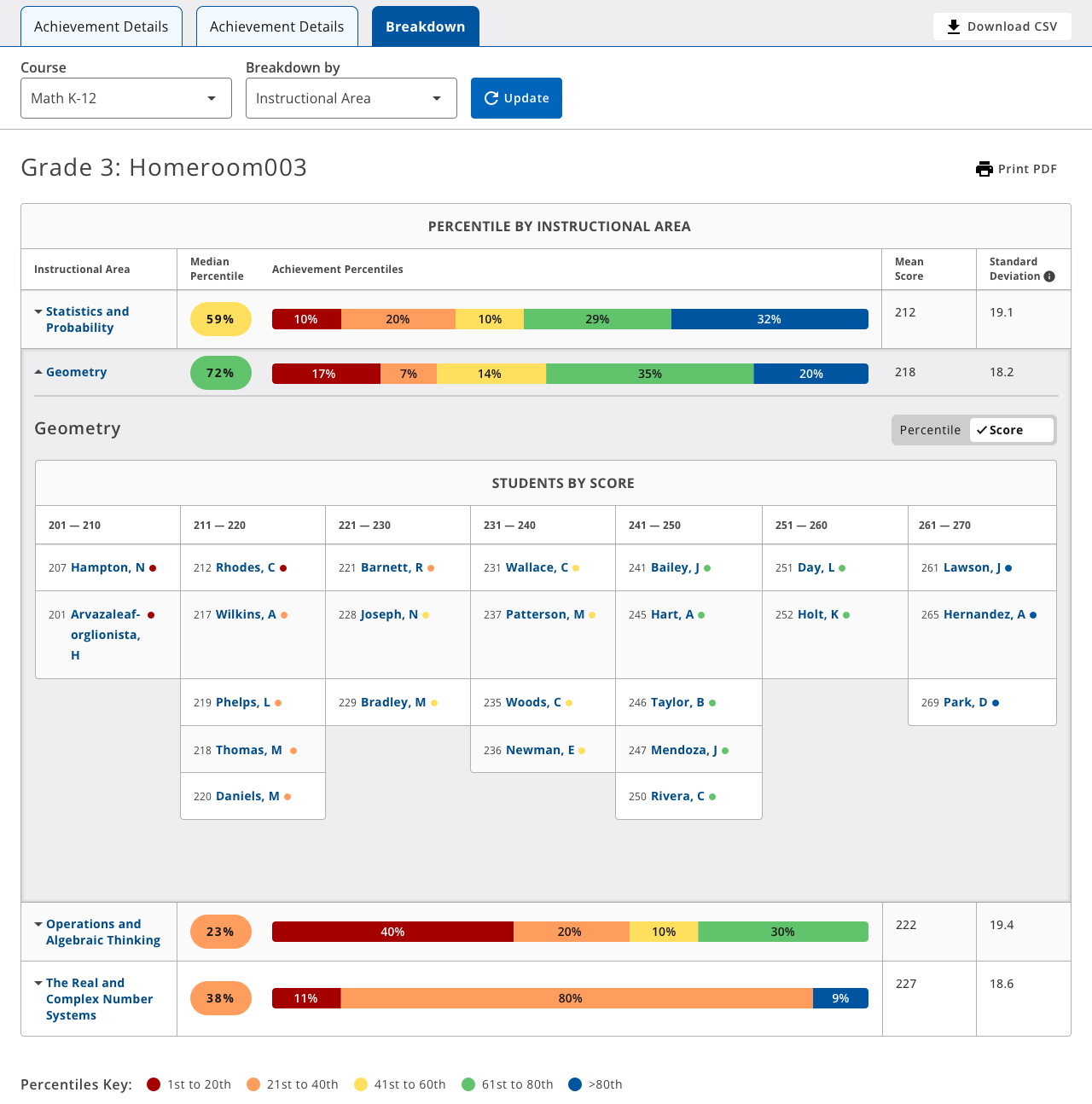
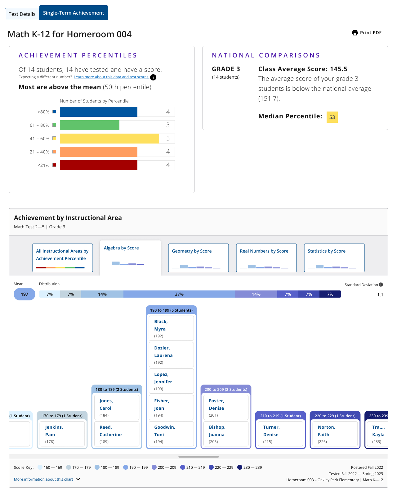
What does the Class Report look like?
Here is a visual depiction of the class-level report in its original state before the incorporation of the 'Breakdown' section. Teachers and administrators use this report to gain a better understanding of how students are performing on tests within a certain class. If users want more than a summary, they can reference 'instructional areas' to understand what types of test questions students are struggling with.
Interviews
User Group
Teachers and administrators who have experience using the two retiring legacy reports
Goals
- Understand the value that the two retiring legacy reports provide to teachers
- Identify the essential elements that we must include in 'Breakdown'
Takeaways
- Users like to see their class from an “overall view” and by each Instructional Area. The 'overall view' gives them a quick overview of how the class is doing, whereas the instructional areas give them more details about where students are exceeding and where they are struggling
- Users wanted reassurance that the new platform would not take away any value that they found in the retiring legacy reports. The retiring legacy reports are outdated and have issues, but they still help users with their daily tasks
Design Exploration
Goal
At the beginning of our exploration, we aimed to discover the most suitable style of data visualization for presenting student scores. Our primary objective was to utilize interactive graphics as opposed to conventional tables for data representation.
Design #1
- The idea of using histograms appealed to us since they are wonderful at visualizing the distribution of a range, precisely aligning with our requirements
- We decided not to further explore this idea because we believed several histograms might be overwhelming to view for users

Design #2
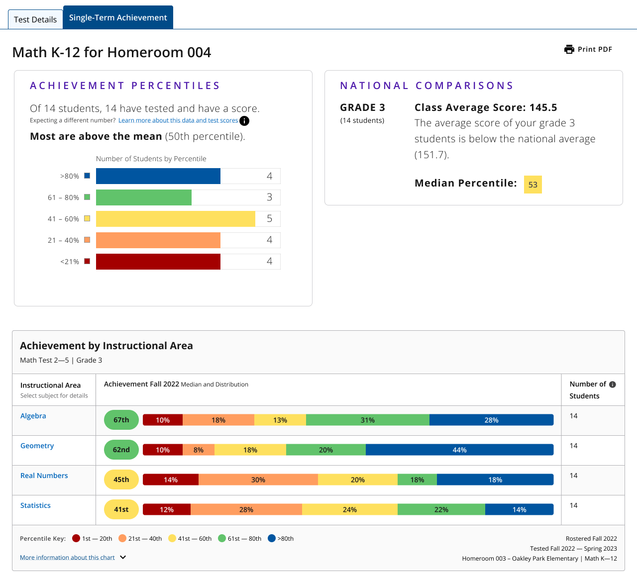
The top right graphic shows how students in a class compare to the national average. However, we didn't further explore this idea because we felt like 'Breakdown' could provide more value than simply comparing class test scores with national averages.
.png)
Design #3
- We found this graphic interesting because users are already acquainted with quadrant charts from other reports
- We appreciated how this graphic provides a concise summary of student performance. However, we recognized that this graphic might be slightly overwhelming due to its busy appearance. Additionally, we felt that interacting with this graphic could potentially be challenging for users.
Design #4
- We were intrigued by the notion of utilizing a stacked bar chart to offer a quick class summary, particularly because users from one of the retiring legacy reports are already familiar with stacked bar charts
- This seemed like a promising idea to explore, as it organizes information in a well-structured manner, while also ensuring clear separation between different groups. With this in mind, we decided to pursue this idea.
Prototype
Goal
After conducting our design exploration, we identified an idea that we wanted to further explore. We decided to create two prototypes based on this idea and present them to users for feedback, gauging which prototype delivers the value they require.


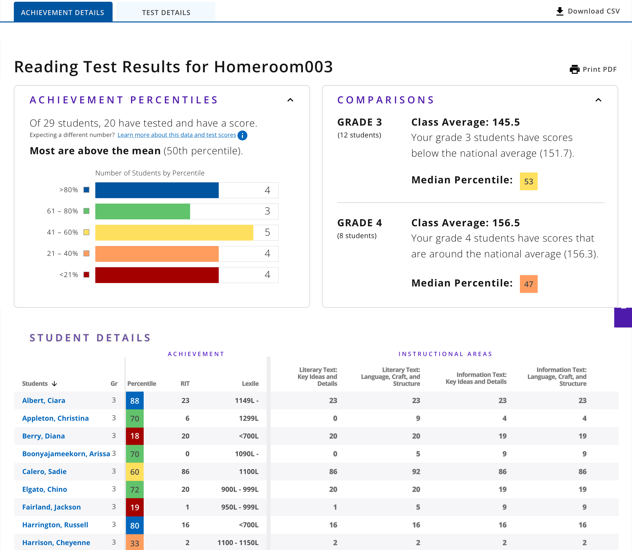
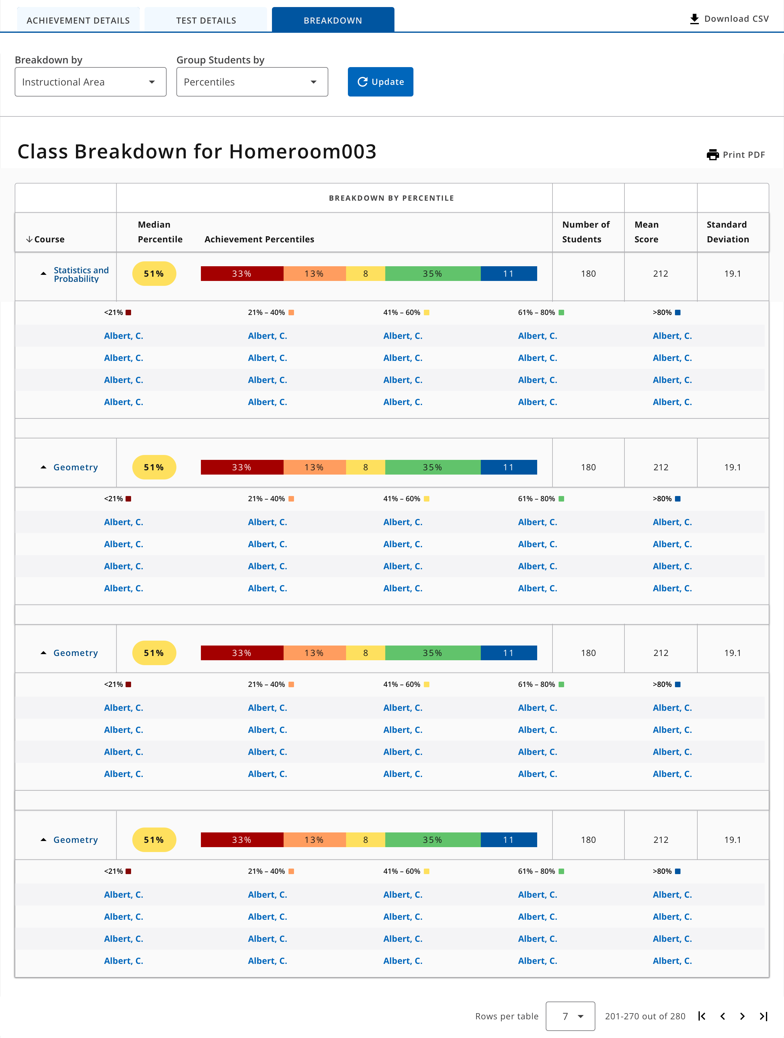
Prototype #1
- We designed this prototype's table to match the same format from the current class-level report
- Users can switch between viewing percentiles or viewing raw scores with the dropdown filter above
- In the table, there are color indicators at the top of each column to differentiate between each percentile
Prototype #2
- The additional empty grey space gives intentional differentiation between summary and individual data
- Users can switch between viewing percentiles or viewing raw scores with the toggle switch above the table
- Color indicators in the data table to show which students fall into each percentile
Interviews & Usability Test
Goals
- Identify what place do the legacy reports hold in users’ assessment review practice? How might we meet needs in new ways?
- Understand how might users react to proposed designs to incorporate ‘Breakdown’ into the new report?
- Gain insight into what additional ‘Breakdown’ options would enhance users’ engagement with assessment results at the class level?
User Group
14 classroom teachers and administrator who are frequent users of retiring legacy reports and the new class-level report
Takeaways
- Users expressed confusion as the columns in the table did not align properly with the data presented in the stacked bar chart. Users were trying to find relationships between data directly above or near the columns in the data
- Despite employing color coding, users still struggled to recognize that the data from the stacked bar charts provided a summary of the information presented in the table
- There are two levels of dropdown filters in the prototype: global and local (global not shown in image above). Users did not recognize that the local filters were specifically for 'Breakdown'
- Users enjoyed that the data table format in 'Breakdown' felt familiar to data tables in other reports
- Users found it confusing that the summary view emphasized percentiles, while the data table focused on raw scores.
- While color coding proved useful to some users, others did not recognize that the data from the stacked bar charts provided a summary of the information in the table
- Users were unsure what the table was referencing
- Users were somewhat overwhelmed by the "boxy nature" of this prototype
- In the data table, teachers need to see students’ first names, not just their first initials
Exploration - Phase 2
Based on the insights gathered from our usability test, it became evident that we needed to reassess how we presented the data to avoid overwhelming users. We considered the possibility of finding a more effective way to visualize the information that was initially captured in the table. With this objective in mind, we began another phase of design exploration.

- This design is an iteration for representing a distribution of students within a histogram
- During our interviews, we recognized a need to visualize raw scores in a way that is more visual than a data table
- We also wanted to differentiate the percentile view and the raw score view, so we considered this gradient color theme
- During the usability tests, we recognized that users were struggling with the dropdown filter, so we considered replacing that interaction with 'selection buttons'
Co-design Workshop
Our team decided to organize a co-design workshop to quickly brainstorm various ideas for how to visually represent raw scores
Takeaways
- We recognized the importance of having the 'selection buttons' serve as a preview, summarizing the data the user can expect to view
- We identified that we want the user to be able to switch between Score and Percentile via a toggle switch, instead of a dropdown filter
- We decided that the scores should be visualized in the form of a histogram that allows users to select a student and see more data related to that student
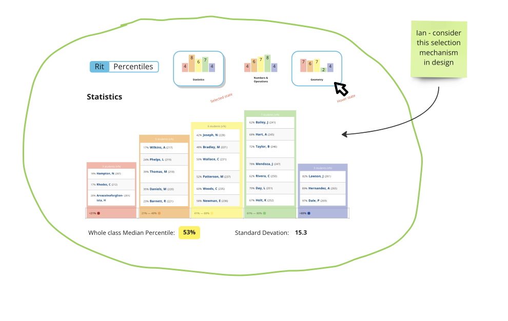
Selection Buttons Iteration
- We wanted our ‘selection buttons’ to provide a preview of the instructional area data. This would give users a glimpse at what the data would look like without needing to click into every instructional area
- One challenge here was to make the ‘selected’ button distinct from the unselected buttons without looking out of place
- Another challenge was fitting the names of instructional areas within the buttons. Instructional areas often have long names, so it was difficult to fit the names within the button while also making it still like a button

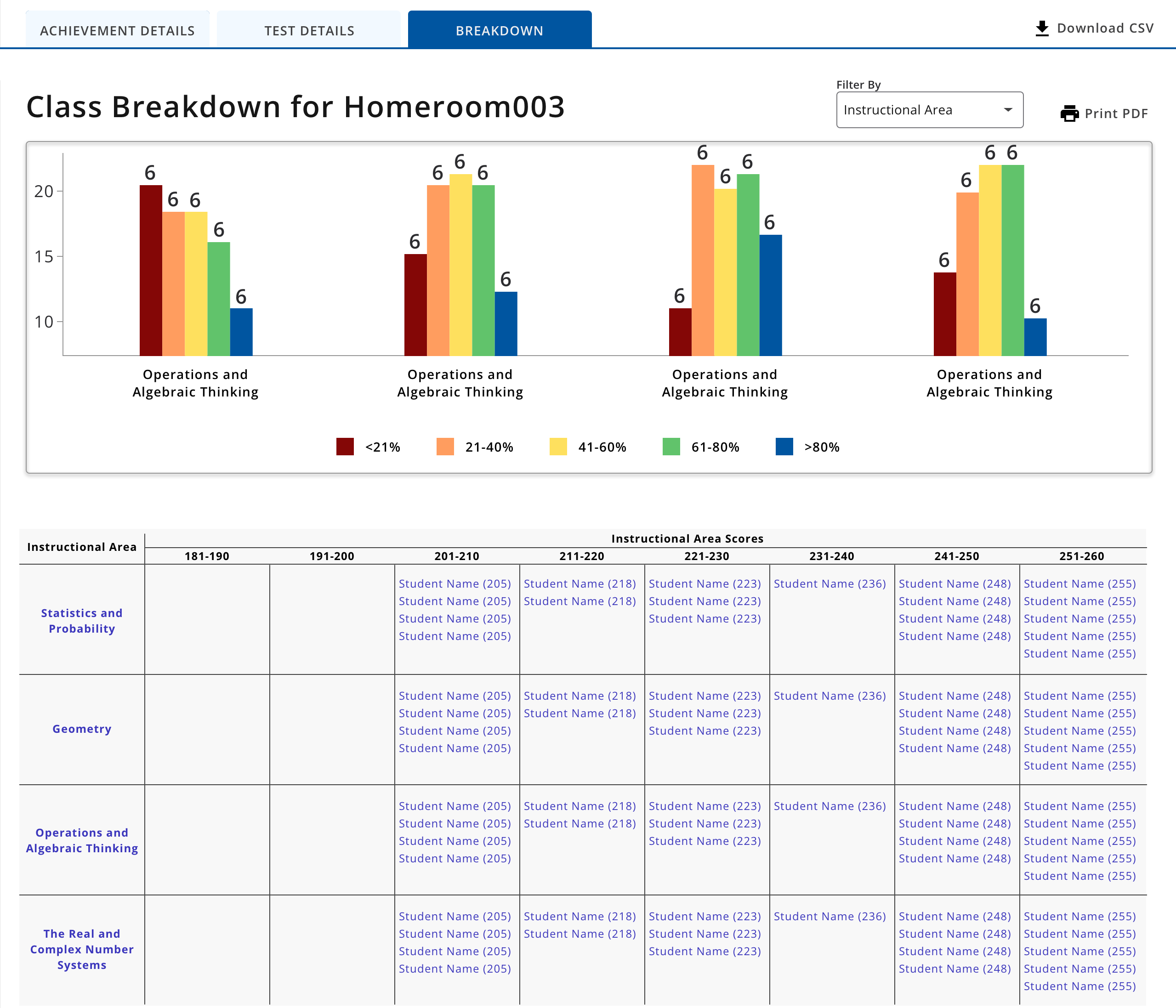
- We represented the raw score data table into a histogram format, allowing users to see the distribution of their class and where students are within that distribution
- We utilized selection buttons instead of dropdown filters
- We grouped percentile summary data with percentile details, and raw score summary data with raw score details
- Through our internal design reviews, we recognized that users might be confused with these selection buttons because they might look like statics visualizations instead of being interactive buttons
- We were informed by our leadership that we would be unable to display which students fell into each percentile. With this information, we needed to reconsider this design
Prototype

'Button' Prototype
We were concerned that the selection buttons would appear more like static visualizations, so we prototyped this idea of 'tabbed buttons.' With this idea, the buttons would appear more like a tab when selected

'Hyperlink' Prototype
- As an alternative to the button prototype, we designed a prototype where the user selects the instructional area name to view the raw score view of that instructional area
- We included a back button in the header to return to the percentile view. We believed this idea would be more clear to users that they have selected an instructional area, and are currently viewing that data
AB Test & Usability Test
User Group
27 classroom teachers, administrators, and testing coordinators who have experience with the two retiring legacy reports and the new report
Goals
- Identify whether this prototype will provide the value that users of the retiring legacy report need
- Identify whether users are able to use pagination in the histogram view
- Identify whether users are able to find specific student scores and percentiles using this prototype
- Understand whether users prefer selection buttons or hyperlinks when viewing instructional areas
Button Prototype Findings
- Nearly half of the participants liked the ‘tab style’ buttons because it gave a preview of the data
- Nearly half of the participants struggled using the buttons because they thought they were static and not buttons
- Most participants were able to find the buttons but they were struggling to understand which button was selected. This displayed a high level of discovery, but a low level of comprehension
Hyperlink Prototype Findings
- Nearly all participants were able to quickly use the hyperlinks to explore instructional areas
- There was very little confusion about the back button and how it was used to navigate within the module
Non-Prototype Feedback
- There was not enough differentiation between the colors in the raw score scale. The gradient colors were too similar
- Users identified that if there was a large class with several students, they would need to continuously scroll up to see the summary view. It was suggested to move the summary information below the histogram view
MVP


- With little time left before the platform launches, we decided to update the design one more time before launch. We planned to release this version as an MVP, and use this semester’s feedback to make updates later in the year
- We iterated on a color theme for raw scores, but we decided to go with a grayscale theme. There are 30 different values that would need distinct colors, so we would either need to use a gradient or 30 distinct colors. During our last round of interviews, we recognized that a gradient wouldn’t work because the colors aren’t distinct enough. We also recognized that 30 distinct colors wouldn’t work either because it is overwhelming, and doesn’t allow for any color memorization.
- Instead of using a pagination menu, we decided to incorporate horizontal arrows into the data visualization. We felt the pagination menu was easy to overlook, and we wanted pagination to be as close to the data visualization as possible.
Design System
.png)
Alongside the integration of the 'Breakdown' feature into the class reporting platform, we have introduced a new element to our Data Visualization Design System. Referred to as a 'base module,' this container encompasses intricate data visualizations along with their controls. The introduction of this component guarantees a consistent and standardized appearance for all Data Visualizations across our design ecosystem.